[Tips wanted] Improving some map elements

Show off your RPG maps, campaigns, and tokens. Share your gaming experiences and stories under General Discussion and save this forum for things you've created that may help others run their own games. Use the subforums when appropriate.

Moderators: dorpond, trevor, Azhrei, Gamerdude

Post Reply
badsequel
Giant
Posts: 115
Joined: Thu May 31, 2012 3:13 am

[Tips wanted] Improving some map elements

Post by badsequel »

Hi all. Hope this is the right place to post this...

I need some tips on how improve some elements in a map I'm working on. There are two areas I am currently struggling with. The map is huge, so I cut out the relevant parts.

1 - adding some depth to the narrow pass with the stone path.
To me this path leading to a cave seem very flat. If someone have a tip on how I'd go about making the path appear to be "down there" that would be great!

Image

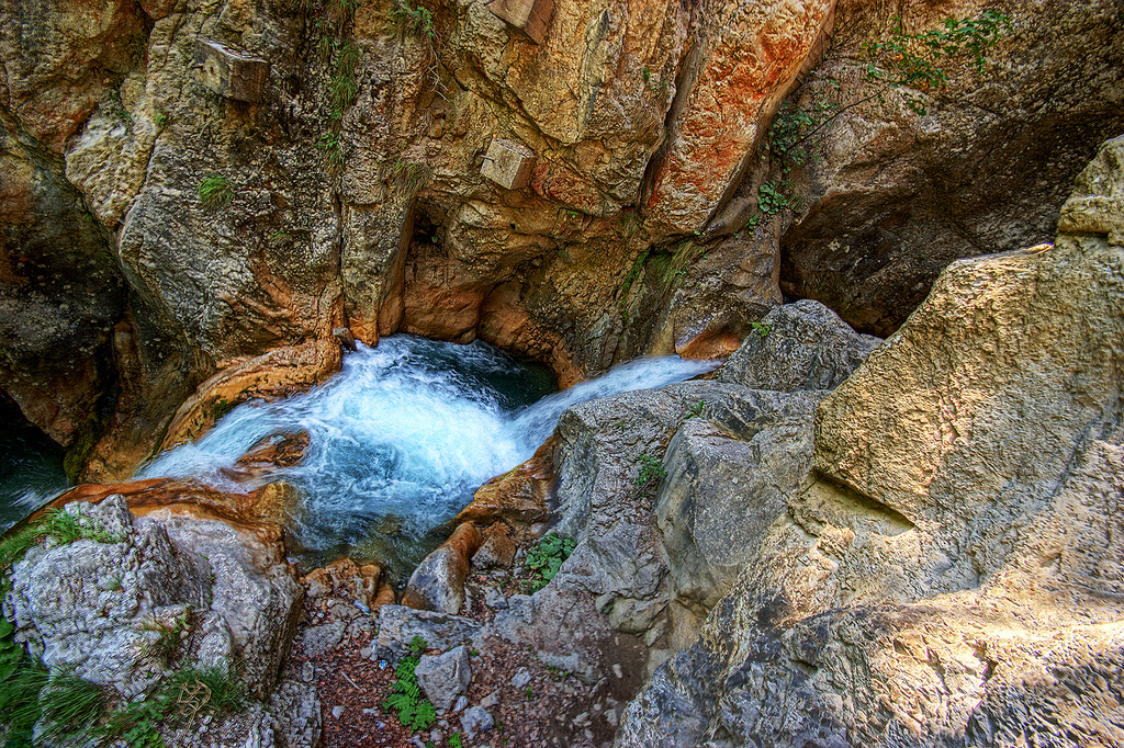
2 - Creating nice waterfalls
Here I'm satisfied with the mountain sides but the intended two waterfall are far from complete. There will be two waterfalls, one from the top of the mountains and one leading down to the small lake below the footbridge.
I've started adding some white highlights on the water layer to make the water appear more alive, but if someone have some other suggestion on how to liven it up there I would love to hear about it.

Image

Other good tips?
Thanx in advance.
My shared rpg stuff:
(exe)TokenNameChanger3: https://www.dropbox.com/s/cqsof54v3dl2k ... 3.zip?dl=0
Tiddly Spell Wiki: https://www.dropbox.com/s/53pya4k68mnvc ... ddly01.htm

Stuff to check out:
Mote Kickstarter(back it): https://www.kickstarter.com/projects/74 ... abletop-ev

User avatar
aliasmask
RPTools Team
Posts: 9029
Joined: Tue Nov 10, 2009 6:11 pm
Location: Bay Area

Re: [Tips wanted] Improving some map elements

Post by aliasmask »

What tools are you using to create maps?

For one, I would draw the path texture larger than path then use the perspective tool so the down slope area has a smaller pattern. For two, it usually helps if you have a definitive line where the water falls, then lighten the splash area. There are some overlays at dunjinni I believe that work pretty well. I used one on this map: http://forums.rptools.net/viewtopic.php?f=77&t=21617

But I'm at best, an amateur map maker and some real artist may speak up.

badsequel
Giant
Posts: 115
Joined: Thu May 31, 2012 3:13 am

Re: [Tips wanted] Improving some map elements

Post by badsequel »

aliasmask wrote:What tools are you using to create maps?

For one, I would draw the path texture larger than path then use the perspective tool so the down slope area has a smaller pattern. For two, it usually helps if you have a definitive line where the water falls, then lighten the splash area. There are some overlays at dunjinni I believe that work pretty well. I used one on this map: http://forums.rptools.net/viewtopic.php?f=77&t=21617

But I'm at best, an amateur map maker and some real artist may speak up.
I use GIMP for map creation.

Perspective tool - I'll look into it. Never thought about that. :oops:

A line for the waterfalls.. Hmm
I'll try making a line in the rocky layer below the water then add more highlighting that the water itself on and around that drop off.

Thanx dude!
My shared rpg stuff:
(exe)TokenNameChanger3: https://www.dropbox.com/s/cqsof54v3dl2k ... 3.zip?dl=0
Tiddly Spell Wiki: https://www.dropbox.com/s/53pya4k68mnvc ... ddly01.htm

Stuff to check out:
Mote Kickstarter(back it): https://www.kickstarter.com/projects/74 ... abletop-ev

badsequel
Giant
Posts: 115
Joined: Thu May 31, 2012 3:13 am

Re: [Tips wanted] Improving some map elements

Post by badsequel »

1 - Stone path

I tried using the perspective tool and yeah, it looks to be a viable approach. But I need to redo the whole layer that holds the path. One thing I noticed when testing was that because the texture pattern im using is has north-south lines in it looks wierd when drawing a curved line and then tweaking the perspecive. I shall retest making a north south path, then tweak the perspective and rotate it. The results should be better.

2 - The waterfall:

I did create a line in the terrain below the water layer and redid the highlighting. To my eyes this looks better.
The waterfall above the footbridge is the best one I think, the other shall be redone later.

Image

Further tips/comments/etc are appreciated.

If someone has a good technique for hand drawing cliffs and ridges I'd love to hear of it. I haven't been able to figure that out yet. Now I'm cheating with a texture pack of varying brightness.
My shared rpg stuff:
(exe)TokenNameChanger3: https://www.dropbox.com/s/cqsof54v3dl2k ... 3.zip?dl=0
Tiddly Spell Wiki: https://www.dropbox.com/s/53pya4k68mnvc ... ddly01.htm

Stuff to check out:
Mote Kickstarter(back it): https://www.kickstarter.com/projects/74 ... abletop-ev

User avatar
aliasmask
RPTools Team
Posts: 9029
Joined: Tue Nov 10, 2009 6:11 pm
Location: Bay Area

Re: [Tips wanted] Improving some map elements

Post by aliasmask »

In your map you have a double water fall? I imagine it going from south to north. I would make the part of the water just before the fall more clear (no rapids) and where the water starts to fall have more of a defined line. Perspective-wise, I would have the fall that is higher be bigger than the lower fall. The lower fall would be more fuzzy or blended. I wasn't talking about an actual line of terrain, but it does seem to work in your example, but more of a whitewater line.

I'm not very good at making cliff sides, but I have a texture of a rocky surface and I impose a rocky surface with vertical lines across the area for a pattern. I then use a warp tool to twirl the top of the cliff to give it a severe drop look as well as darkening that area a bit more. It also breaks up the pattern a bit. I just kind of just tweak it until I think it looks reasonable, sort of like a waterfall.

I found this interesting pic of a waterfall from above:
Spoiler
Image

username
Dragon
Posts: 277
Joined: Sun Sep 04, 2011 7:01 am

Re: [Tips wanted] Improving some map elements

Post by username »

Some perspective tips:
[*] Use less shadow (for the cliffs), the higher up you go. That makes the trail go upward as the eye assumes the hill top to be even.
[*] make things whiter the higher up they are. Looks closer to the "light" and less engulfed in surrounding shadow.
[*] blur the items farther away. Items closer appear focussed.

Use these with discretion. Overdoing looks silly. (But doing top-down depth is hard.)

badsequel
Giant
Posts: 115
Joined: Thu May 31, 2012 3:13 am

Re: [Tips wanted] Improving some map elements

Post by badsequel »

Thank you for useful feedback guys.

In addition to your comments here I had a lengthy discussion with an artist friend of mine last night about the above two pictures. He came to the same conclusion as you, username, that doing top-down depths is difficult. But, we did come to a theoretic approach on how to improve the map and I will try to implement it.

Now if I only hadn't poked my left eye(my good eye) on that darned pine branch while picking blueberries today I might get to work on that map right now...

Kids - be careful when picking blueberries - it's more dangerous than you think. :wink:
My shared rpg stuff:
(exe)TokenNameChanger3: https://www.dropbox.com/s/cqsof54v3dl2k ... 3.zip?dl=0
Tiddly Spell Wiki: https://www.dropbox.com/s/53pya4k68mnvc ... ddly01.htm

Stuff to check out:
Mote Kickstarter(back it): https://www.kickstarter.com/projects/74 ... abletop-ev

Post Reply

Return to “User Creations”